Contact
Say Hello
Have a cool project? Want to get in contact or just want to say hello? Drop me a line.
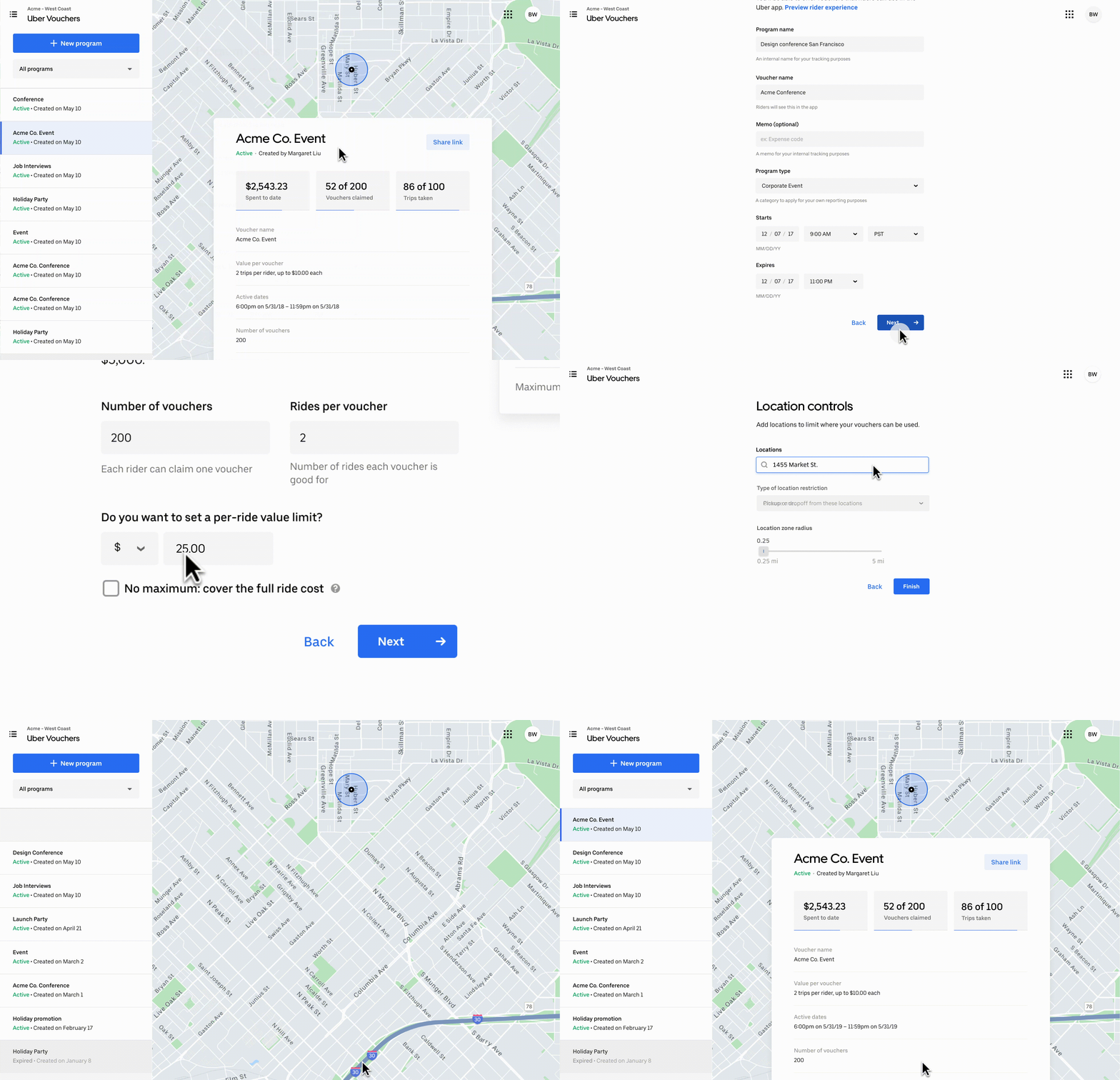
Vouchers can be thought of as promo codes 2.0. They are a way for companies to create and easily distribute “gift cards with restrictions” where they only pay for value that is actually used. For instance, we wanted companies to be able to create vouchers for a company holiday party with 200 employees to be used on a specific day, from a specific location, and with a set maximum ride value. We also wanted transit companies to be able to create last-mile-vouchers for residents of areas without public transportation on UberPool, and for riders to pay a flat fare (price of a bus ticket) and the rest would be covered by the voucher up to a certain amount. In any of these instances, if the rider only used $10 of a $15 voucher, the company would only pay $10.
Examples of other use cases:

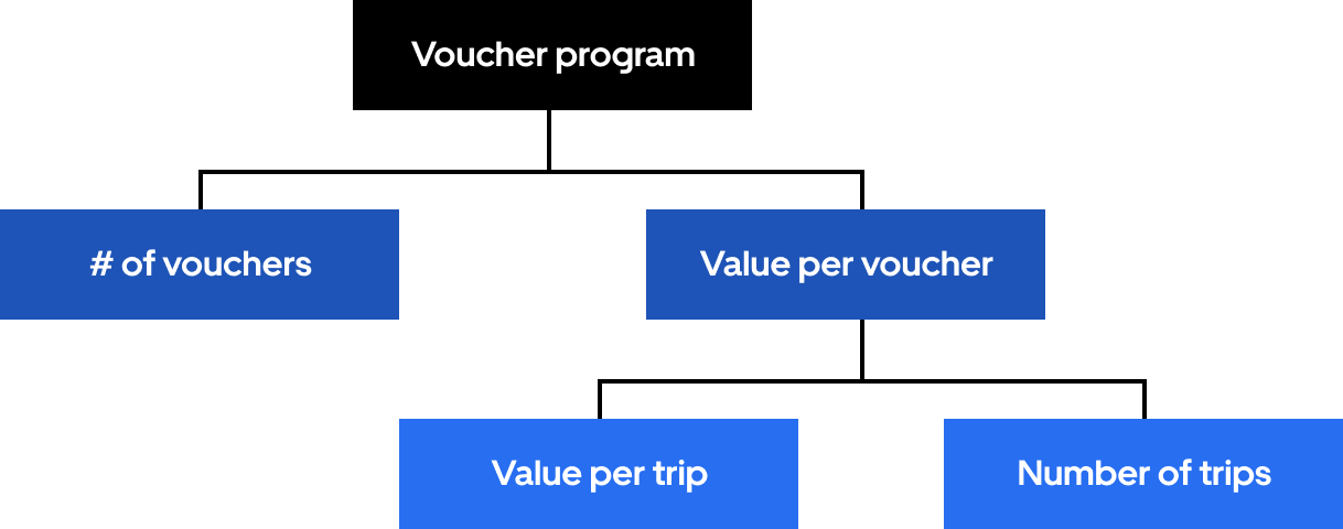
Vouchers could be created in bulk or individually, but in this project we focused on bulk creation. When you create a bulk of vouchers, it is called a program. The value of a program is calculated by the number of vouchers, and the value per voucher. The value per voucher is determined by the value per trip and the number of trips.

The focus of this project is on the value per voucher.
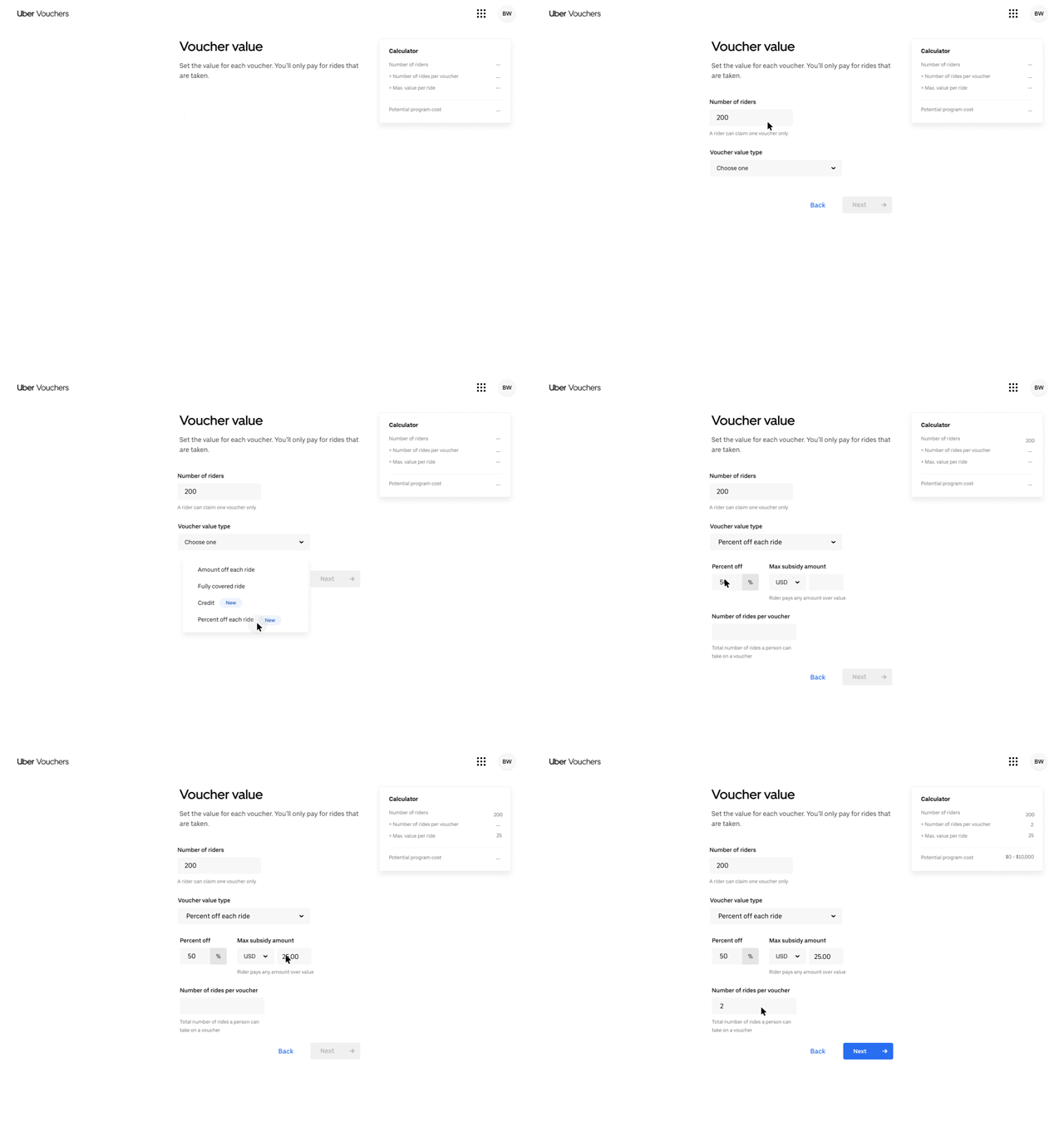
At the time, the value per trip on each voucher was limited to a fully covered trip and $X max amount per trip. We wanted to introduce the following new value types:
Vouchers as a product is inherently versatile. There are a million ways you can mix and match the features to create a fully customized voucher. We needed to design a way of imbedding the new value types so that users could discover new ways of using vouchers, but also find the solution to their current needs. We were working with two conflicting principles–an interface that affords exploration and discoverability but also streamlines the creation process. Would they be able to work in the same interface or should we prioritize one over the other? Was the interface the best place for both these principles?
We started by creating a set of principles to make sure our team would stay aligned on tough decisions and to set a framework for when we would add Eats vouchers.
Simplicity through focus. Our users love Uber because of how simple it is to use. One of our greatest achievements for businesses is operational efficiency. We wanted to stay true to how we benefit our users and why our users value our products.
Inspiration through discovery. The beauty of Vouchers is the millions of ways it can be used. From promotions, to events, to just getting a guest somewhere, the possibilities are endless. Our users don’t yet know how Vouchers can solve their problems, so we want to make sure they can be inspired and discover new ways to use Vouchers.
From the business’s point of view. We talk to businesses, which in turn talk to consumers. While we design for both, we want to keep the business’s POV top of mind when designing new products. Our tone, content, and functionality should always cater to our direct users.
Design for the majority. Even though our objective is to expand our reach, we will always make sure our designs are optimized for our biggest use cases. It’s important to remember our core user group and ensure they still have a seamless experience with the new value types that we introduce.
While developing approaches, we tried to decide how we should present the information to our users. What are their motivations and priorities? What do they want to set first?
Approach 1: Overall budget
If our users are focused on the overall campaign budget, we would have them set the number of vouchers they wanted to give first. This approach caters to users who have a set number of people in mind already.
Approach 2: Budget per person
On the flip side, users might be given a budget per person but not a number of people. Here, we’d have them set the per voucher value first.
Approach 3: Promotion or value offering
Some users are focused more on what promotion or value they want to give and less by what kind of budget they have. If this was the case, we’d show what value types we have per trip first and have them go from there.
Approach 4: Discovery and exploration
We also knew there might be users who were unsure of how vouchers could solve their problem. In this case, we wanted vouchers to be a tool for them to explore different solutions and find the best fit.
Approach 5: We choose for you
A more aggressive version of approach 4 would be for us to choose a solution for the user based off of a set of questions we would ask about their problem.
We already had a significant cohort of users on the product that did not need the new value types. While we wanted to make the new value types discoverable, we didn’t want them to impede our current users' workflow. So we considered different ways we could make the new value types an optional feature, and decided on having an “advanced” and "default" set up.
User testing revealed 2 key insights:
This project showed an uncommon, but very real truth about modern day design; our technology surpassed our users’ ability. While we had all the technical capabilities of offering the most versatile and robust voucher, the majority of our users were only concerned with the most basic value type. We scaled down our offerings by removing features that were not yet part of known use cases and by whitelisting some value types that we knew would be used only by specific companies.

As a dance coach, I’m constantly finding verbal cues for my athletes that will incite the most effective physical response from them. For example, “sweep your leg like you’re drawing a rainbow” is much easier to do than “lightly kick your leg in an arch.” Design, like teaching dance, is all about condensing information into a visual cue that is both sticky and easy for our users. But coaches never settle on just a “good” verbal cue, we want the best possible one that will make our athletes the best in the competition. In the same way, a design is never finished until it represents the best-possible visual cue. Until our design is actually used, we can never be sure of its success. We had strong indications from user testing that approach 4 could be successful, but for now–with our current scope and deadline–we decided to build and ship our solution and wait for more data before we iterate again. The important part of the design is that it takes future modification into consideration and exists not as a “solution” but as a framework for change.
Have a cool project? Want to get in contact or just want to say hello? Drop me a line.